Brand
Boo
For wayOUT volunteers and members
Version 1 · October 2026

What’s inside.
wayOUT empowers grassroots organizations to make a lasting, positive impact on LGBTQ+ youth across the nation. By making affirming spaces and life-saving resources more accessible in local communities, we are creating a safer WAY for queer youth to be OUT as their most authentic selves wherever they are.
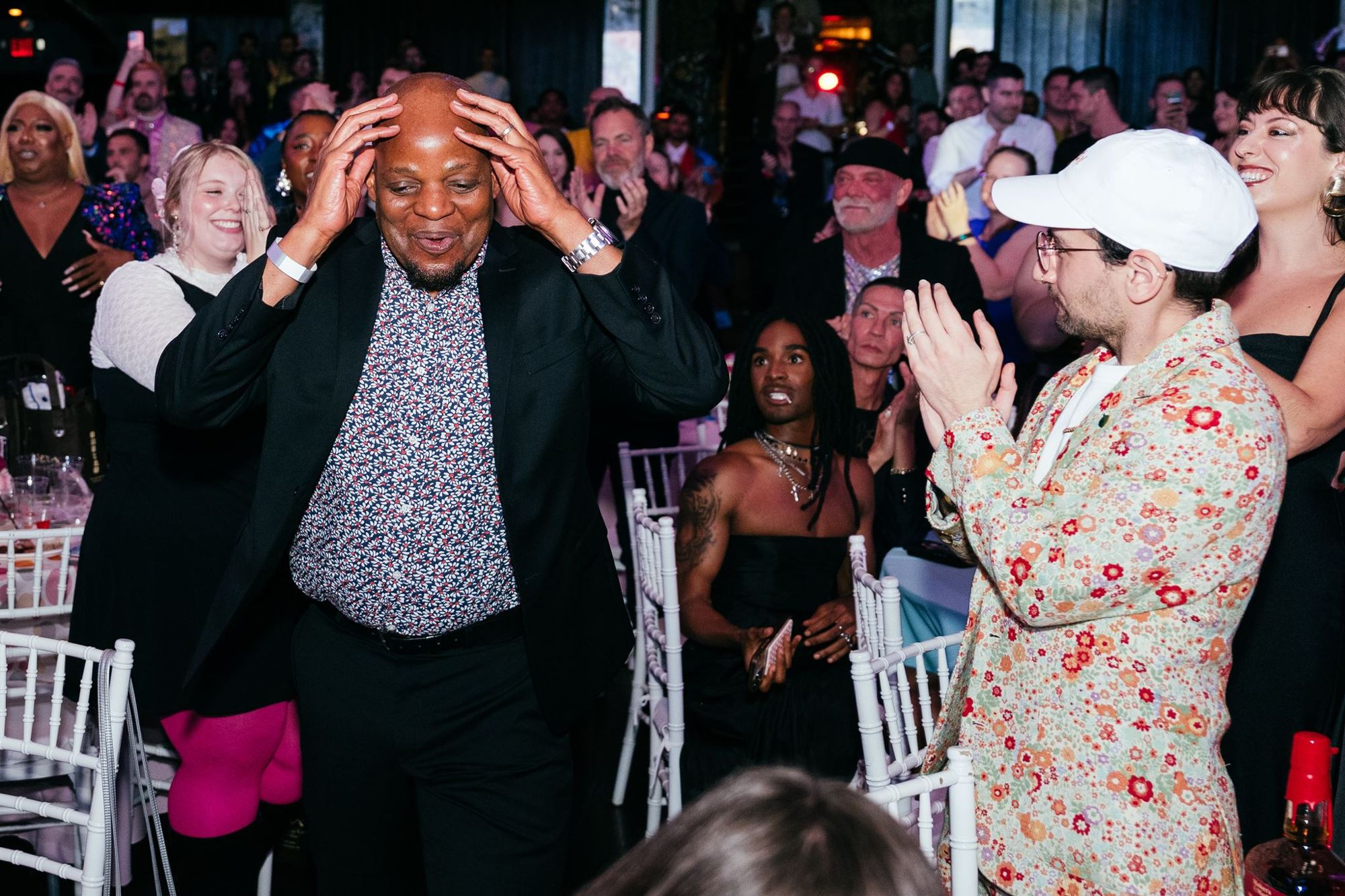 LA 2025 · the moment the total went up · Photo by Kit Karzen
Doing good should feel good. 100% of proceeds to queer youth.
The wayOUT LGBTQ Foundation is a 100% volunteer-run 501(c)(3). We fundraise in progressive communities through events, activations and our Gaylas, and send 100% of proceeds to small, local LGBTQ+ youth organizations in the places where it’s hardest to grow up queer.
100%
of what we raise goes to the youth organizations. Every year since 2016.
2
active chapters, Los Angeles and Seattle. New York and the Bay Area came before.
$115,000+
LA 2025 for Sweet Evening Breeze, Louisville
$199,898
LA 2024 for Outright Vermont
Our values spell it out.
Six values, one for every letter of the name. Written with the board. Use them to make a call when the brand book doesn’t cover it.
Welcome everyone.
Giving shouldn’t need a gala budget. Anyone can join in.
All of it goes out.
100% of proceeds go to the youth organizations, because we’re all volunteers.
Youth first.
Every decision starts with the young person it reaches.
On the ground.
We back local leaders who already know their community, and they decide how to spend it.
United.
Chapters, donors and youth organizations, connected.
Turn up the joy.
The night should feel as good as the giving.
volunteer. Nobody gets paid. 100% of proceeds go to the youth organizations.
Say it.“All volunteer since 2016” on the site, every deck, every sponsor ask.
Show it.Name and picture the people who made the night: hosts, committee, photographers.
Invite it.Every page ends with a way in: give, host, volunteer.
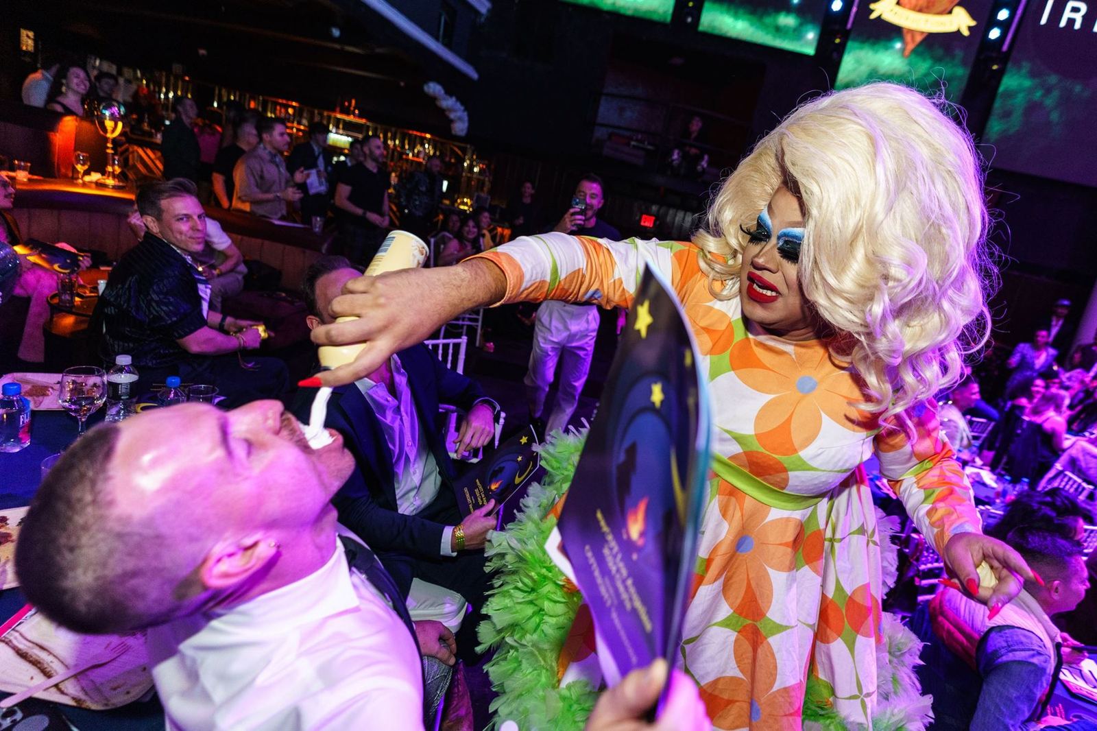
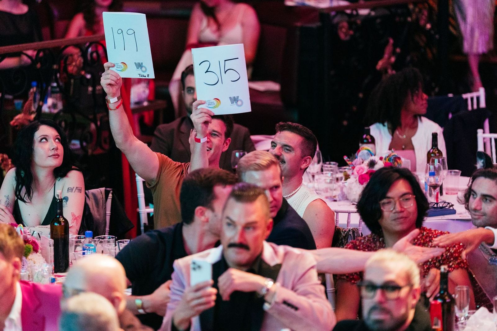
LA Gayla · Photo by Kit Karzen
Joy is the strategy.
The Gayla is a night out, not a lecture. The brand brings loud color, real people, a little camp, and every fundraising lever there is.
Feels like
A night out with your chosen family. A wink in the copy, a crowd in the photo.
Make it real
Joy gets people in the room. A real story and a clear number show them why it matters.
A horizontal logo, finally.
The one we’ve seriously needed. It’s now the primary logo, and it goes first everywhere: the site, decks, sponsor walls, social headers. Night on light backgrounds, white on night.
SVG and PNG, light and dark, in the brand kit: wayout.lgbt/brand-kit
Letters in Night #2A0F5C or white. The rings are always the four brand colors, in order.
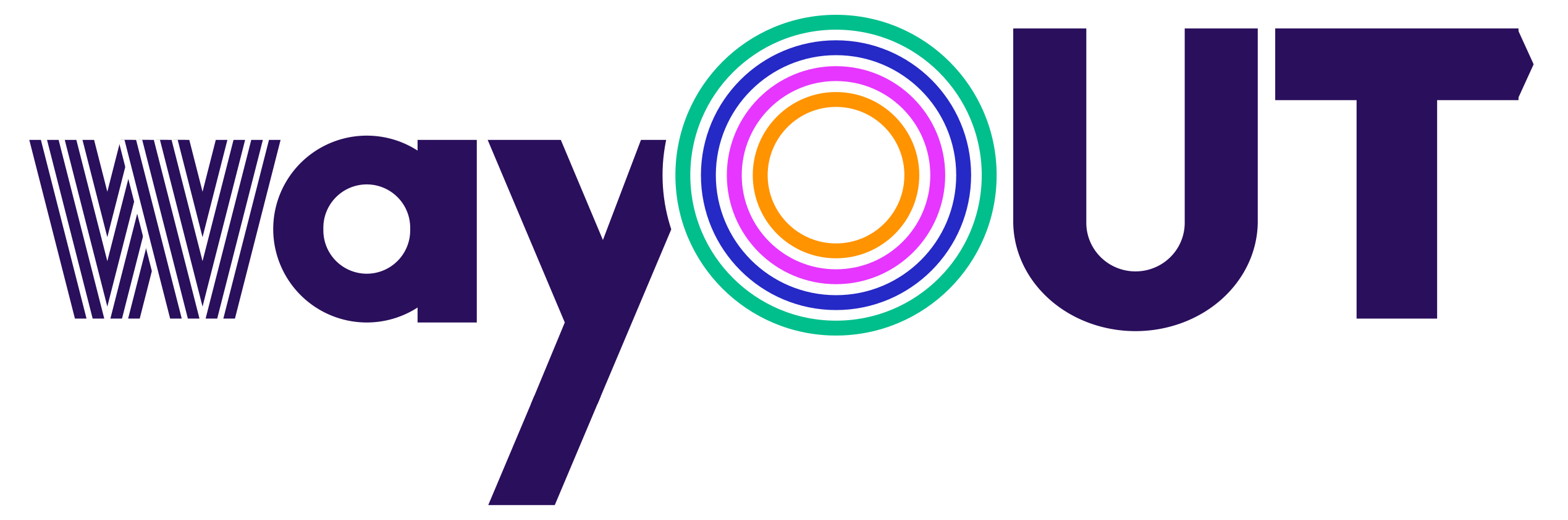
way OUT.
“way” points. “OUT” is where we’re going. The logo keeps our heritage: the arrow from the first logo, the gradient from the second. Every part is on purpose, so nobody “fixes” it.
The striped WFour stripes, a nod to 70s graphics. Never solid in the full-color logo.
The round aIts bowl is a true circle, so it echoes the O.
Even spacingw to a matches a to y. O to U matches U to T. Measured, not eyeballed.
The hidden arrowArm and tail make an even “>” (in magenta) pointing at OUT. Motion, built in.
The O and the overlapFour rings: a door you walk through, a ripple that spreads.
The T pointThe 2016 arrow, back as a small point (in orange), cut at the y’s angles. Both ends, one angle.
Three more versions.
One job each.
Stacked logo
For square spaces: social avatars, stickers, the back of a T-shirt. The wordmark under the W uses the same letters as the primary logo.

Stacked, one color
The black and white mark with the solid O, kept and updated: the new wordmark, the clean W and the same gap where the O meets the W. For stamps, merch and anything printed in one ink.

One-color logo
For one-ink jobs: screen print, foil, single-color print. The gaps are cut out, so the surface shows through. Stitched or tiny: the solid logo.
Leave clear space on every side equal to the radius of the O. Nothing else sits inside it. Minimum size: the horizontal logo 120px wide on screen, 1 inch in print. Smaller than that, use the solid logo; for favicons and avatars, the W and O mark.
Ten years. Two logos.
For 2026 only. The striped 1 tucks in next to the O, so the logo itself reads 10. Use the wide one wherever there's room, the square one wherever there isn't.

Wide: site header, email, banners, step-and-repeat, sponsor slides.
Square: social avatars, stickers, merch, anything narrow.
2026 only. In 2027 the primary logo comes back. Never use both on one piece.
Ten years in the making.
A brand with ten years behind it has hit its first heritage milestone. The new logo honors where it came from.
2016 · The arrow. A T that points the way.
2018 · The gradient. Color that flows.
2026 · Both, refined. The arrow in the T, the color in the O.
Retired colors. Old files used eight near-matches. Swap any of these for the palette on page 15.
#FF9300 · #A325F1 · #2628BE · #00BAA6 · #00CCCC · #0066FF · #FFB850 · #E636FF in the old ring mix
Never use the old logos.
All of these are retired, all the way back to the first one. If you find one on a flyer, a sponsor’s site or an old Canva file, swap in the new logo and tell us.
The original, 2016. WAY / OUT in rainbow brackets.
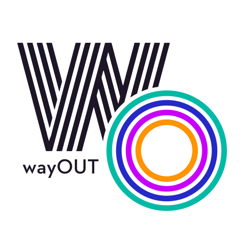
Thin stacked mark, old teal rings.
Reversed mark, old lilac rings.

Target icon. Use the stacked mark.
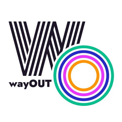
2026 interim mark, old wordmark.
How to tell: if the y has no arrow, the a isn’t round, or the T has no point, it’s an old file. The new logos are on pages 8 to 11.
Don’t redraw the logo. Ever.
Don’t · StretchedDon’t · Recolored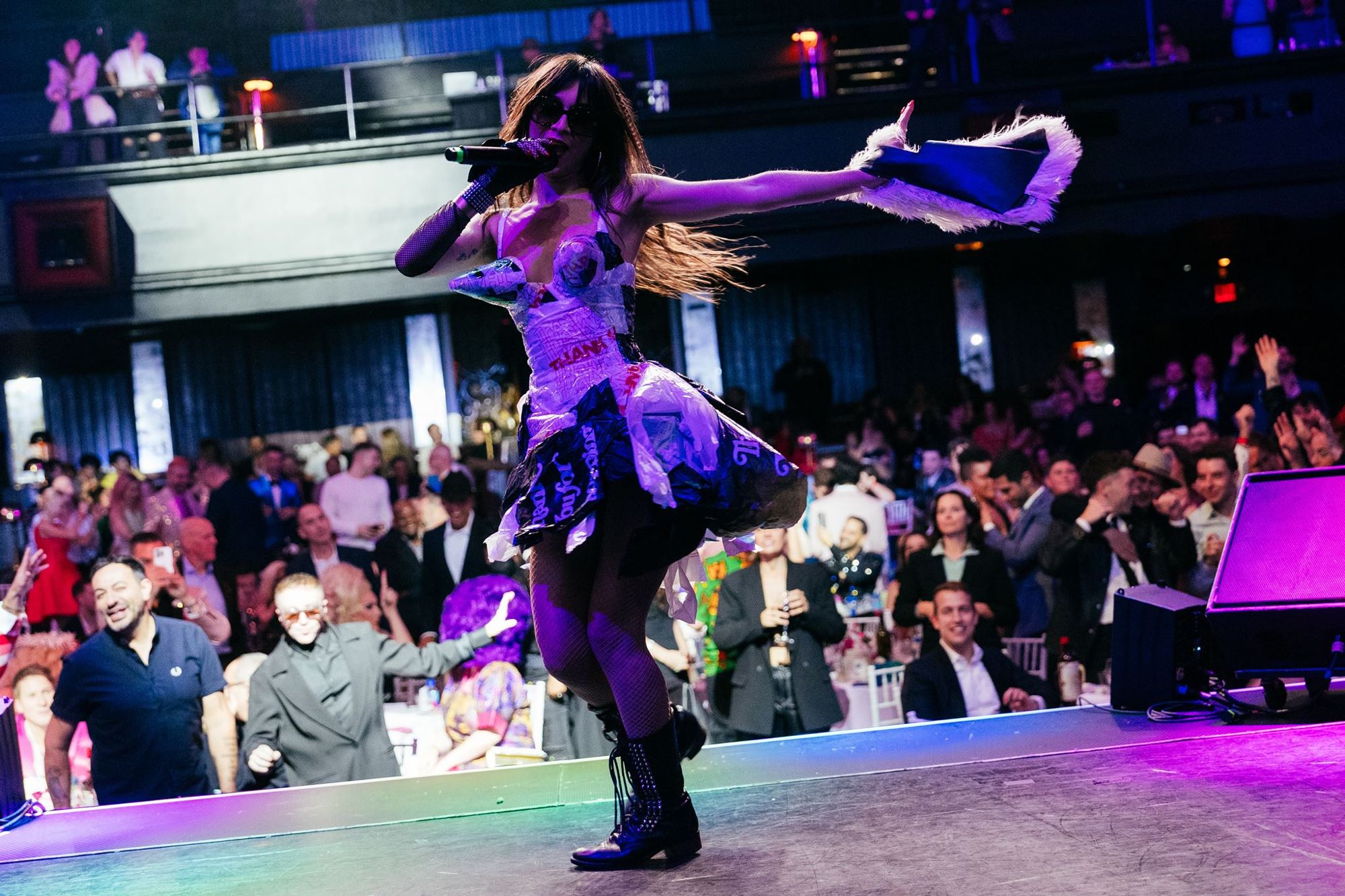 Don’t · On a busy photo
Recolor the rings or change their order. Jade outside, then cobalt, magenta, orange.
Stretch, squash, tilt or outline the logo, or add a shadow or glow.
Close the gap around the O, or move the O off the y.
Retype the wordmark in another font, or set “wayout” or “Way Out”. It’s always wayOUT.
Put it on a busy photo without a solid panel behind it.
Use the rings alone as the logo. The ring O and half O are shapes, not logos.
Use the files as they are, at any size above the minimum, with the clear space around them. Writing about us: wayOUT, or The wayOUT LGBTQ Foundation the first time.

Turn
it up.
The rainbow is our community’s heritage, so we kept it, in colors that are ours, inspired by Verner Panton’s Curve. Gayla Night holds it together. Key Lime Kiki is the wink.
Logo, headlines, masthead
#00BF8CRGB 0 191 140Jade
Seafoam Sequin
#A6E9D7
#2529C6RGB 37 41 198Cobalt
Lavender Menace
#B3B4EB
#E636FFRGB 230 54 255Magenta
Lip Gloss Pink
#F6B9FF
#FF9300RGB 255 147 0Orange
Mimosa
#FFD9A6
#A9BF00Chartreuse
Lime Spritz
#E1E9A6
Pairings that work.
Big fields of one color, Gayla Night type on top. White type only on Gayla Night and Ballroom Blue.
Give now.
Spotlight Orange + Gayla NightAll volunteer since 2016.
Gayla Night + white + Green CarnationLA GAYLA
Mother Magenta + Gayla Night · events$199,898
Ballroom Blue + white · the numbersWho we fund
Green Carnation + Gayla NightPages stay light.
House Lights White + Eyeliner BlackLines, pills, accents. Never behind text.
Headers and grounds behind type.
Never white type on Green Carnation, Mother Magenta or Spotlight Orange. Never the ring colors as body text. Key Lime Kiki only as a sliver: the stripe, a tag, a highlight.
One typeface for every job.
Queer youth shouldn’t have to leave home.
Jost Medium for leads and captions. Jost Regular for body text, with plenty of air between lines.
Jost Bold, spaced capitals, for labels
$199,898
Jost 900 for big totals and every other number.
2016
01
02
Step numbers, years and small stats, between 40px and 90px, one or two moments per page. Never words, never body text.
Free to use: Jost and Monoton are both on Google Fonts. Jost does everything; Monoton is only the accent. Phosphate is retired: don’t use it anywhere.
Everything is built from the O.
The ring O ripples out, unrolls into the ribbon and splits into the half O. Patterns fill big surfaces. Use one shape per layout.
Ripples · behind a portrait or a hero, fading out
W and O ribbon · the signature, orange on top
Swoop · title and closing slides
Wave · borders and bands
Ring dots · behind a cut-out person

Wallpaper, solid · backdrops, step-and-repeat, merch
Bands always touch. Order is fixed. Corners are round, never sharp. It runs off the edge of the page; it never floats.
A pattern fills a whole surface or a whole shape. Never a pattern behind text you need to read.
Patterns go behind people.
Ring dots are a full field behind a cut-out person: the dots carry the brand, the person carries the feeling. The wallpapers fill big surfaces with no one in front of them. One pattern per layout, never behind body text.
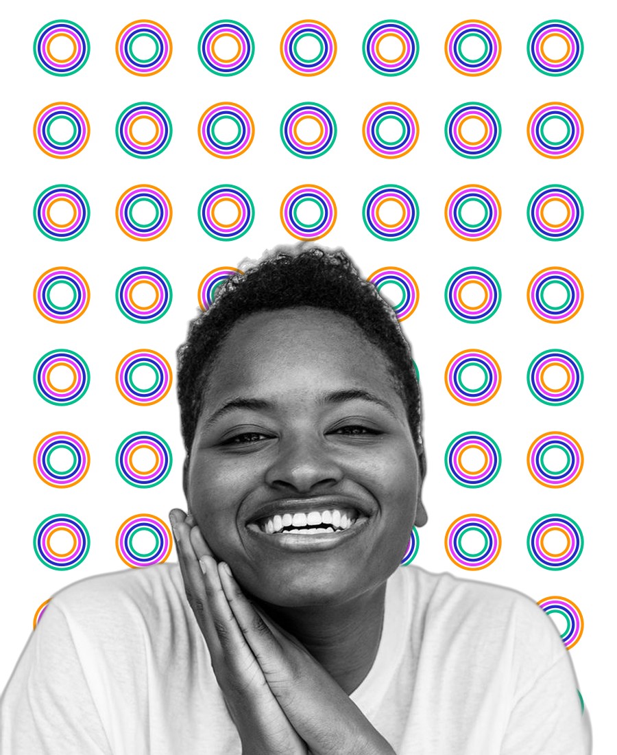
Ring dots on white · Who We Fund, Instagram, reports
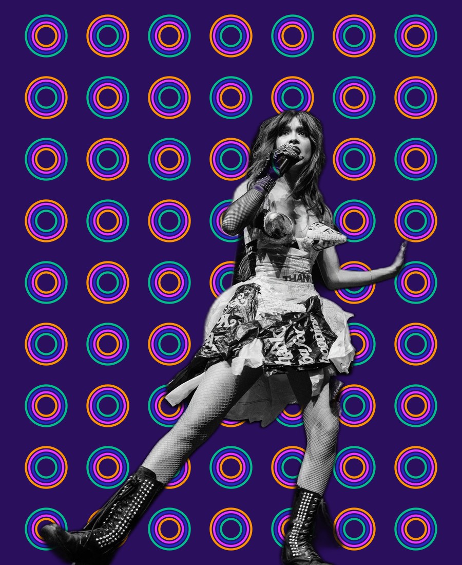
Ring dots on night · Gayla posters and tickets
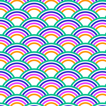
Wallpaper, open · lighter surfaces, merch
Wallpaper, solid · backdrops, step-and-repeat
One ribbon, sixteen moves.
The ribbon steps, loops, runs and rolls to frame a slide, a cover or a page. Pick one per layout. Orange always rides on top.
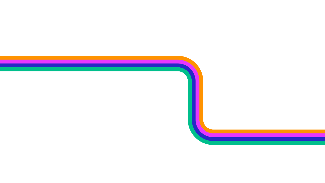
Title steptitle slides
Title step, invertedtitle slides
Corner, top rightcovers
Corner, top leftcovers
Corner, bottom leftclosers
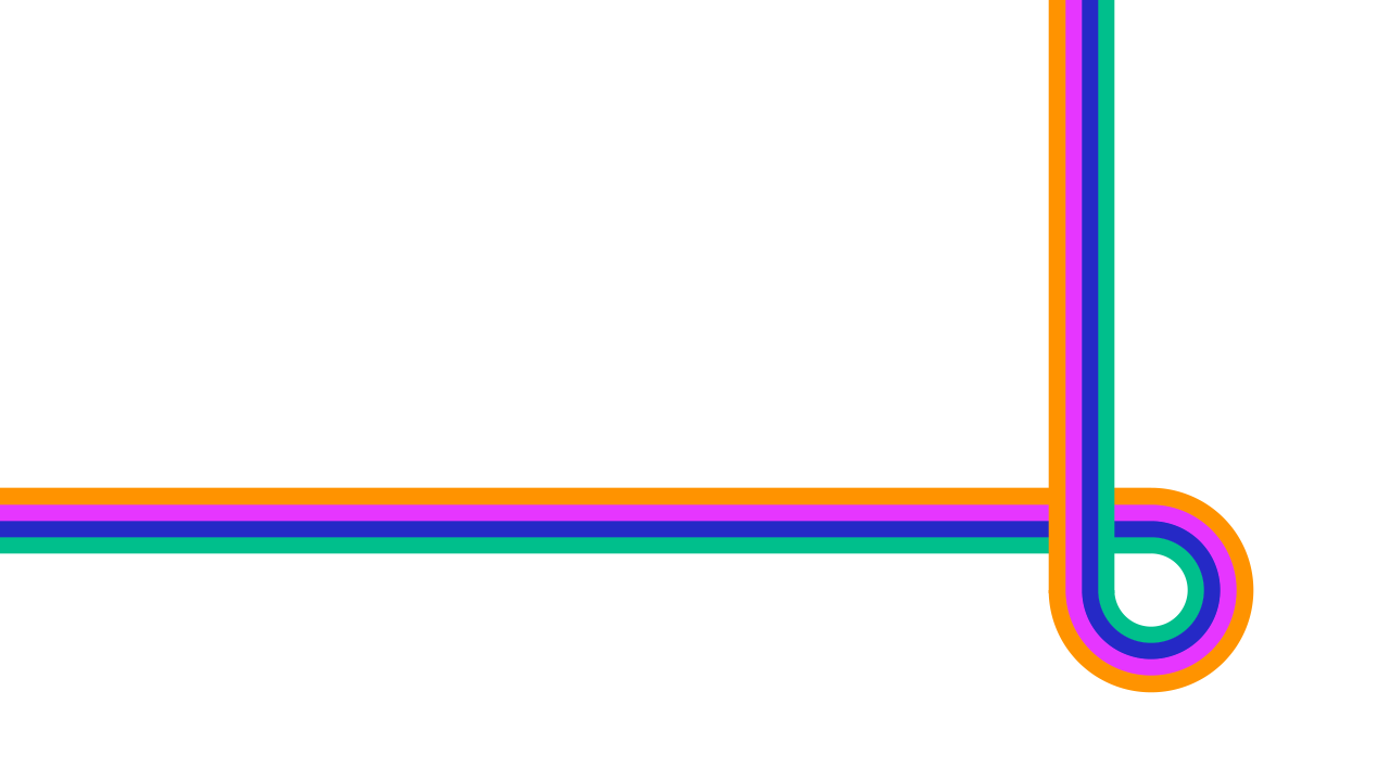
Corner, bottom rightclosers

Bottom runcontent slides

Top runcontent slides
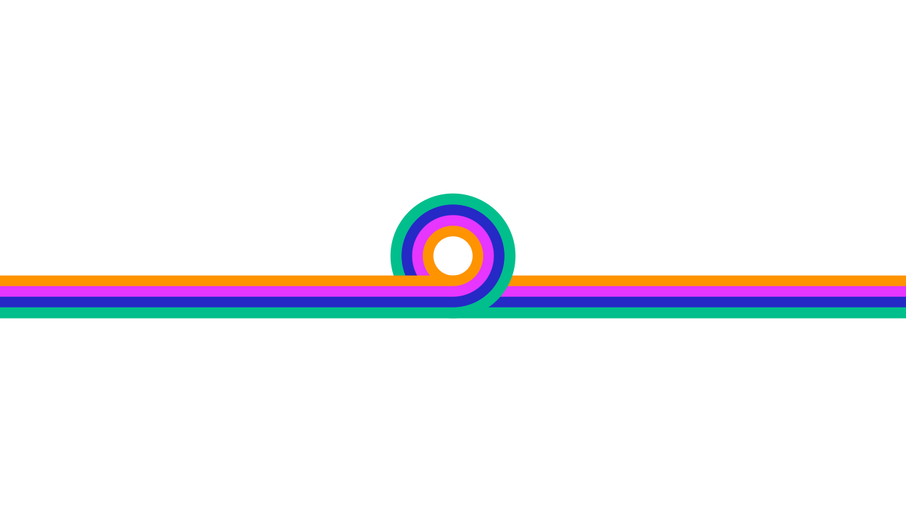
Loop dividersection breaks
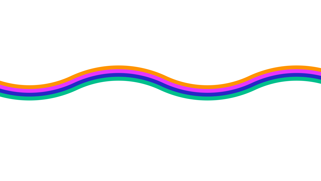
Wavebackgrounds
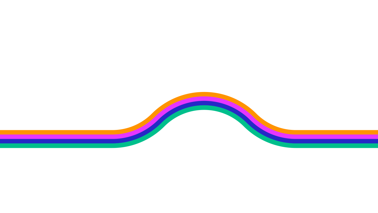
Single crestunder a big number
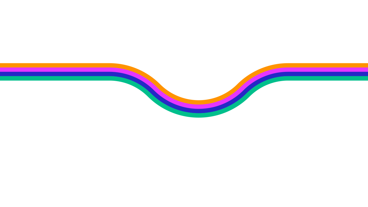
Single dipabove a headline
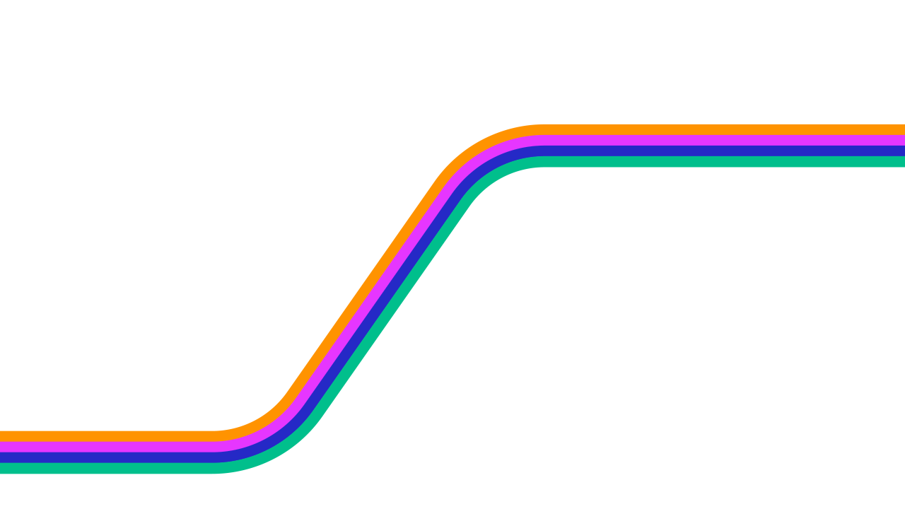
Swooptitle and closing
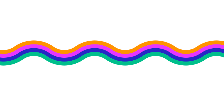
Soft waveborders
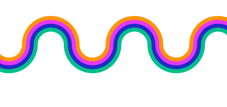
Single wavebands
Medium wavebands
A small mark with a few jobs.
Exactly half the logo’s O. One at a time, small, never as a bullet or a row.
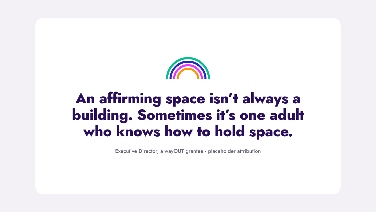
Half O · opens a pull quote
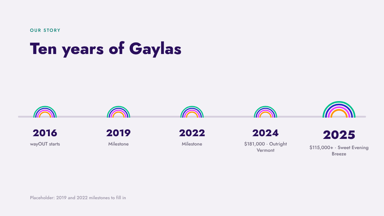
Half O · marks years on a timeline
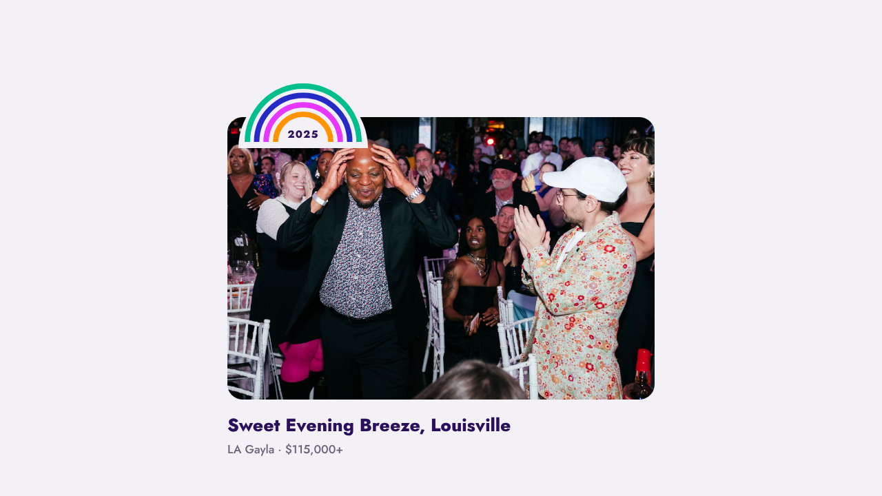
Half O · tabs a photo with the year
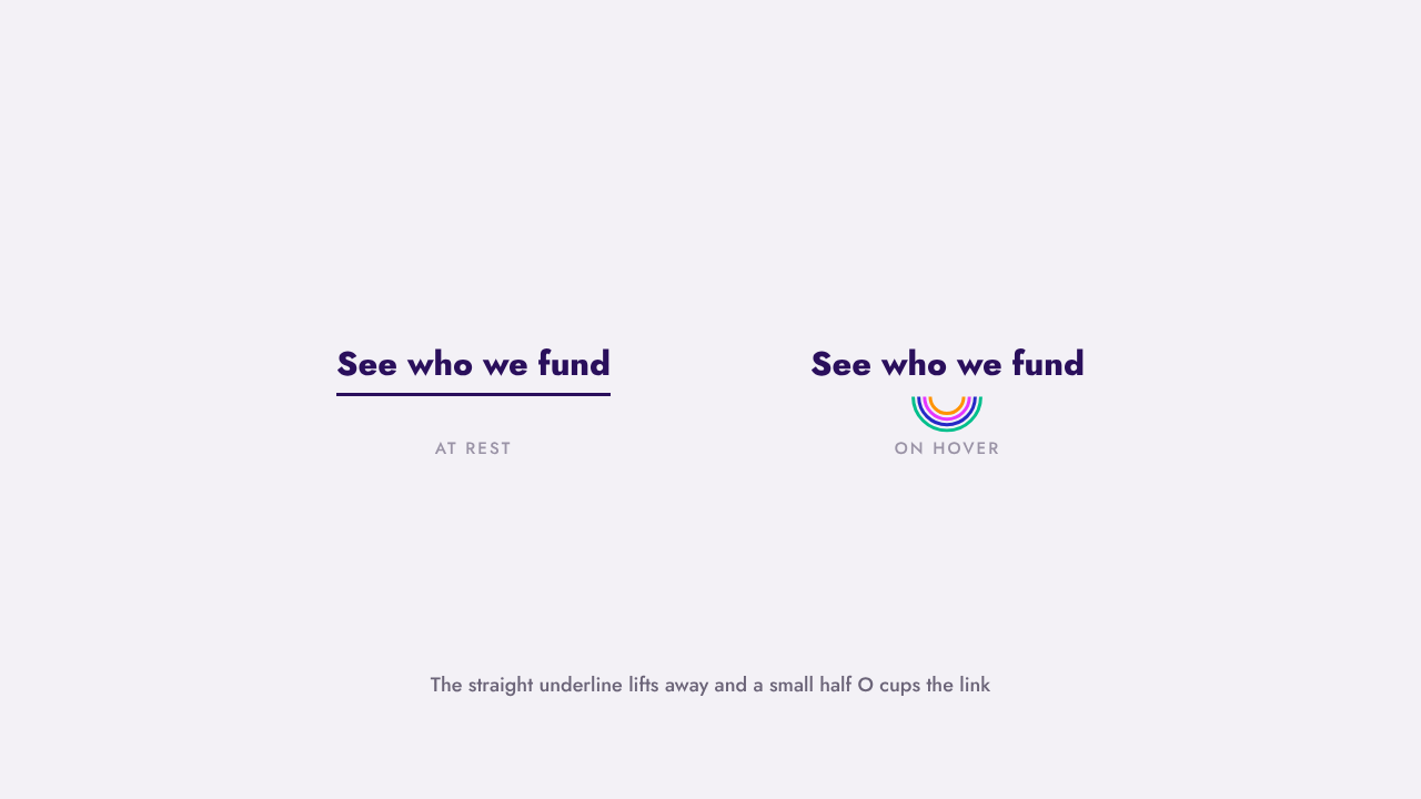
Half O · smiles under a link on hover

The half O sits right way up, like the logo. Only the link hover turns it upside down, as a smile.
Two kinds of photo. Both are real.
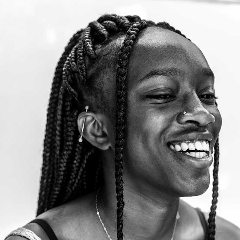
The young people
Black and white, close up, smiling. Always real youth from a grantee, with the organization’s permission. Caption who they’re with, never their story without consent.
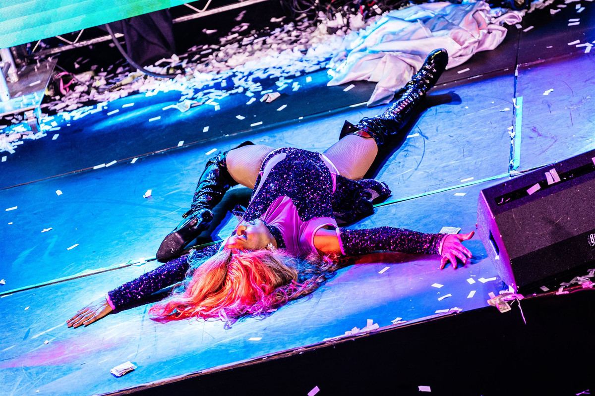
The Gayla
Full color, in the crowd, mid-moment. Performers, paddles up, people hugging. Never a stiff group shot when a candid exists.
“Photo by” with the photographer’s name, every time. Our photographers are volunteers too: Kit Karzen, Easton Schirra, Clint Keller.
Sound like the friend who got you involved.
01
Fun first
“We make giving fun, then send 100% of proceeds to small, local LGBTQ+ youth organizations.” Not “Please consider supporting our mission.”
02
Volunteers in every sentence
“Run by volunteers. 100% of proceeds go out.” Say it plainly and often.
03
Specific beats big
“$115,000+ for Sweet Evening Breeze in Louisville.” A name and a number, never “making a difference”.
04
Short and direct
Short sentences. No jargon. Write it the way you’d say it at the bar.
wayOUT, always. The formal name is The wayOUT LGBTQ Foundation.
Young people or youth. Never “kids”.
Youth organizations for the people we fund. Not every grantee is a center.
LGBTQ+ by default. And 100% volunteer, always.
Words that include.
These are the defaults. The person you’re writing about outranks all of them: use the words they use for themselves.
Use the pronouns people use. Singular “they” is fine. Say “pronouns,” not “preferred pronouns.” Never guess in a caption: ask, or use their name.
Many young people use it and we use it for the community. For a person, only if they use it.
Our house style. When writing about a grantee, use the form they use, like LGBTQIA+ or 2SLGBTQ+. GLAAD writes LGBTQ.
It happens. Correct it, thank whoever flagged it and keep going: “Thanks for the catch: they.” A quick fix beats a long apology. In print or online, fix it and note the update.
Ask the grantee. Then check GLAAD’s Media Reference Guide at glaad.org/reference.
Out in the world.
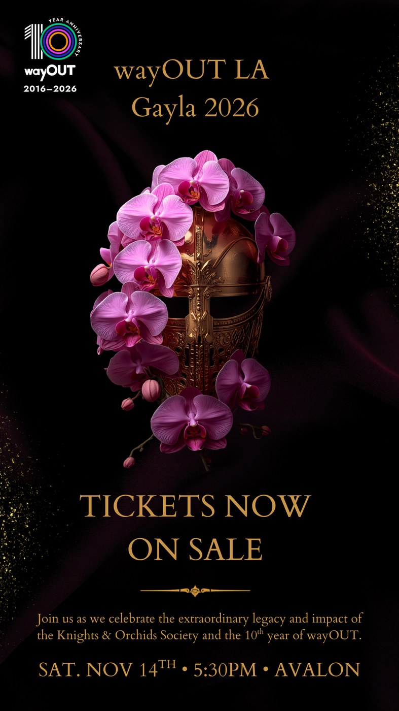
Gayla poster
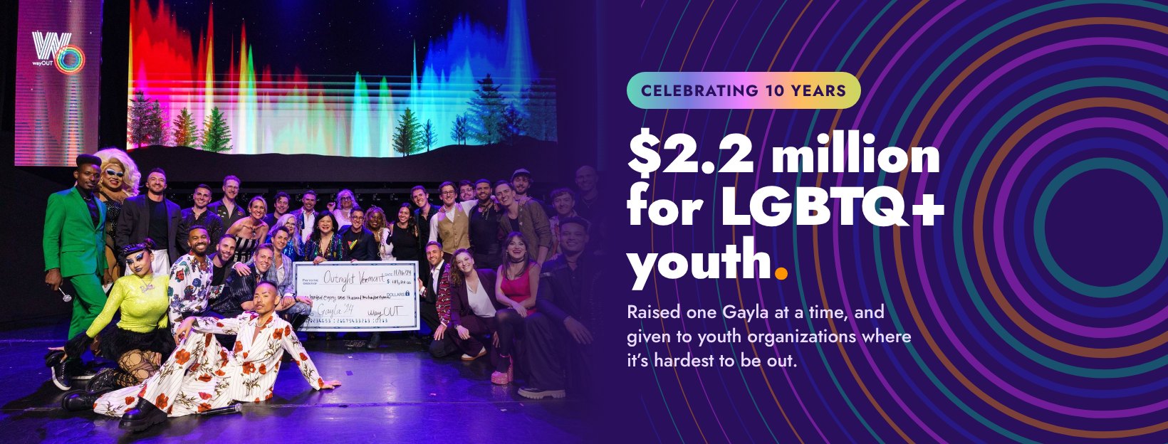
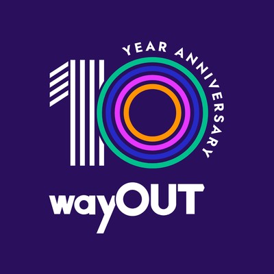
Social cover and avatar
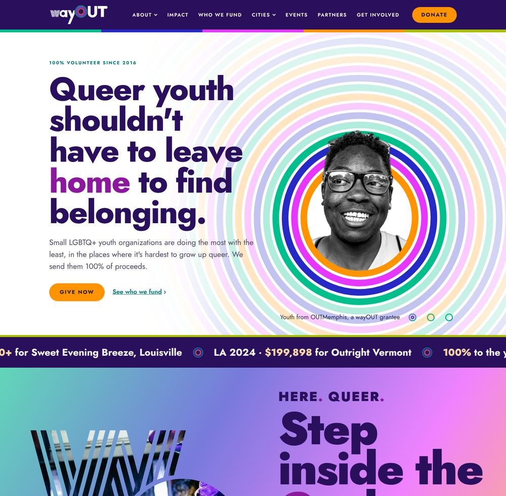
wayout.lgbt
Every file: wayout.lgbt/brand-kit
Questions, or a logo
you’re not sure about?
brenden@wayout.lgbt
Created by